

DPAC Rising Stars Visual Art Gallery
Featuring artwork from participating Triangle High Schools. Juried by José Cruz, Kelly Oakes and Ina Liu.
On Exhibit One Night Only May 9, 2024 at the Durham Performing Arts Center,123 Vivian Street
-

Stereotypes by Emily Sexton
12th Grade
Longleaf School of the Arts
18x18
acrylic paint on canvas
Stereotypes and pressured opinions are a major part of our culture especially among women and how they present themselves. I chose to depict a young girl unhappily surrounded by makeup to represent the unwanted and unrealistic expectations of today’s beauty standards.
-
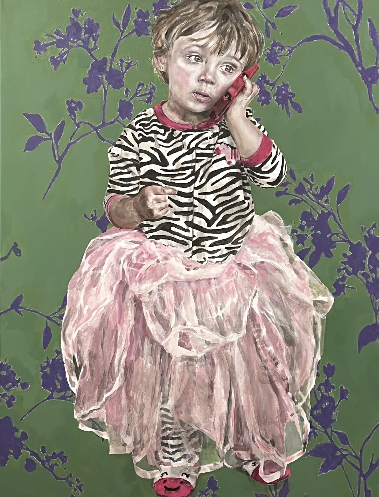
Tutu by Paige Madison Hoerner
12th Grade
Longleaf School of the Arts
40 x 30
Acrylic on Canvas
Art nouvou inspired graphic floral background, with a young girl in a oversized tutu, speaking on the phone.
I have always been surrounded by younger children and feel a strong connection with them, I admire their capacity to be carefree. I feel a frustration with the access to modern technology, children are rushing to grow up a fit within mature spaces. I enjoy playing with the loose concept of youth and its connection to fantasy, with playful elements.
-

The Faerie Forest by Shirley Yang
11th Grade
Ravenscroft School
13 x 19
Cut Glass Mosaic
I was inspired by the concept of a mysterious forest, perhaps with some magical creatures lurking among the trees. I’ve always loved the fantasy genre, and been fascinated by stories of faeries. With this mosaic, I tried to encapsulate the magic and wonder I feel when engaging with the fantasy genre with my use of lighting, and my slightly unusual color choices. I used red, purple, teal for the trees and lighting, instead of colors typically found on many trees. I cut the glass in long, organic pieces to mimic the appearance of bark and roots, using different colors of glass to add depth and shading. I let the foliage and landscape follow the shapes of my glass, letting the piece change and grow as I worked on it. Simulating lighting was the most difficult, as I had to think about which places the light would hit, and put the appropriate glass pieces there, instead of adding lighting or shadows later on in the process, as I typically would with a drawing or painting. Since I wanted the forest to seem foggy, I used lighter and more muted colors for trees further in the background to create that effect. Overall I’m very happy with the result, and love how the bright teal and green pieces catch the eye.
-
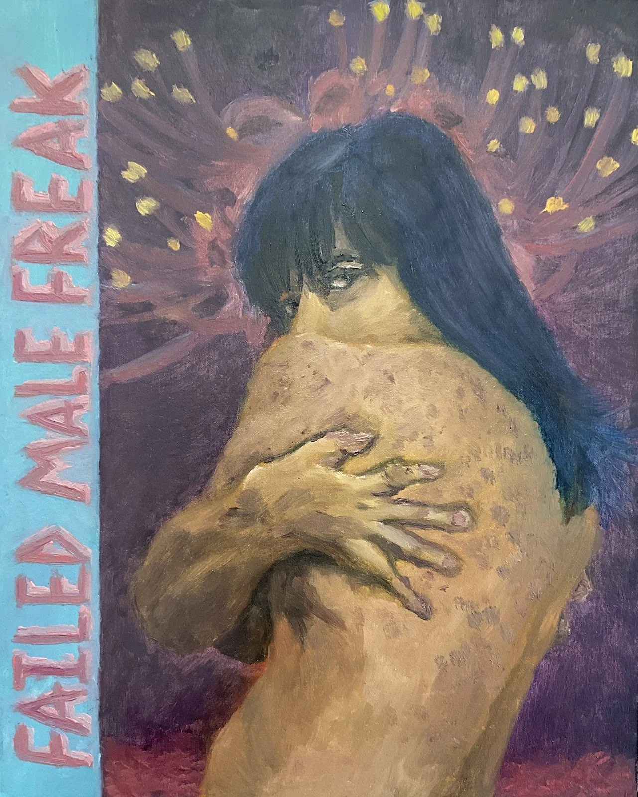
FAILED MALE FREAK by Andrea Morales
12th Grade
Western Harnett High School
16 inches x 20 inches
Oil paint on canvas board
The creation of FAILED MALE FREAK marked my first anniversary of having started feminizing Hormonal Replacement Therapy, as well as my first time using oil paints. As such, the experience of being a trans woman of color has influenced the creation of this self-portrait. Said experience may be described as being denied one’s status of womanhood, but yet also often being degraded, objectified, and fetishized. Any transfeminine person is likely aware of how close death looms over our heads, either by our own hands or by those of others. This piece aims to reflect on that experience as well as to reclaim some of the pejorative terms used against us and to glare back at a potential transmisogynistic gaze of the depiction of my nude body.
-

Sisters by Madison Merriweather
10th Grade
Southern School of Energy and Sustainability
18x24 in
Pencil and Charcoal
My name is Madison. I mostly create realistic portrait drawings. But I also like to explore other art styles and try new art forms. I use mechanical pencils for sketching and shading and charcoal for shading the darkest parts I couldn’t get from a mechanical or regular pencil. I made this piece because I don’t have a sister and I wanted to imagine what it would be like to have a sister in a surrealist style. The connected hair represents blood intertwined and how we would be similar. The sister on ground and the other sister in the sky was to show how we would be different. The hearts made from the braids was my imagination of how my relationship with my sister would be if I had one.
-

"The Wiz" Production Poster by Greyson McIntyre
12th Grade
Longleaf School of the Arts
30"x20" (inches)
Digital Art
I'm excited to share my artist statement about the poster I created for the "The Wiz" play at our school. As an artist, my goal was to capture the brilliant energy, deep cultural significance, and everlasting themes of this iconic musical.
Using the lead actors from our school's theater production—Hailey Dockery, Jada Scott, Zae Suggs, and Amari Wynne—I created the poster inspired by the vivid colors, lively characters, and magical trip seen in "The Wiz". I used a combination of typography and illustration to try to convey the spirit of the story's imagined setting while honoring its roots in black culture. To that end, I drew our actors in some of the original costumes from both the classic film adaptation and the original play.
The yellow brick road, which has become a symbol of self-discovery for Dorothy and her friends, is one of the focal points of the artwork. The production's heart and soul, Emerald City, is the driving force behind them as they travel, with aspects of magic, music, and community all around them.
In addition to promoting the event itself, I wanted my design to inspire awe and enthusiasm. "The Wiz" is a celebration of friendship, resiliency, and the strength of self-belief rather than just a musical.
I hope that my poster captures the spirit of "The Wiz" and entices audiences to join us on this magical journey. Thank you for considering my contribution to our school's production.
-

Tears of Pearl by Camille Corey
11th Grade
Longleaf School of the Arts
15 x 16 x 13
Tears of Pearl is a soft sculpture made of velvet-like fabric and designed to resemble a Faberge egg
Tears of Pearl is a soft sculpture made of velvet-like fabric and designed to resemble a Faberge egg. It sports three faces modeled after the three main characters from the Slavic fairytale by the same name 'Tears of Pearl'. In the fairytale, there are three children under the care of their wicked mother or stepmother-- depending on the character-- each of which gets up to their own magical escapades after the one step-daughter is blessed so that when she cries, her tears become pearls, when she smiles, rose petals fall from her lips, and when she touches water, golden fish spawn in that water. The woman's daughter is cursed when she attempts to retrace her step-sister's footsteps and is revealed to have a wicked heart. With this curse, her tears turn to lizards, from her mouth fall toads, and when she touches water, snakes appear. Soon after, the girls’ brother leaves home and by a comedy of errors is killed by a king only to be brought back to life by magical waters from various different seas. The aim of this sculpture was to tie together some of the themes found in this story into a cohesive piece. Each of the three faces on the egg has been designed to include elements from the story that pertain to the individual character, for example, one face is circled by two golden fish representing the fish that the step-daughter can summon, while another of the faces has a snake on it representing the serpents the daughter brings.
For inspiration I referenced the story written by Alex Chodsko in his 1906 publication of stories under the name "Tears of Pearl". The story I used goes by the same name and is the first in the collection which can be found here.
-
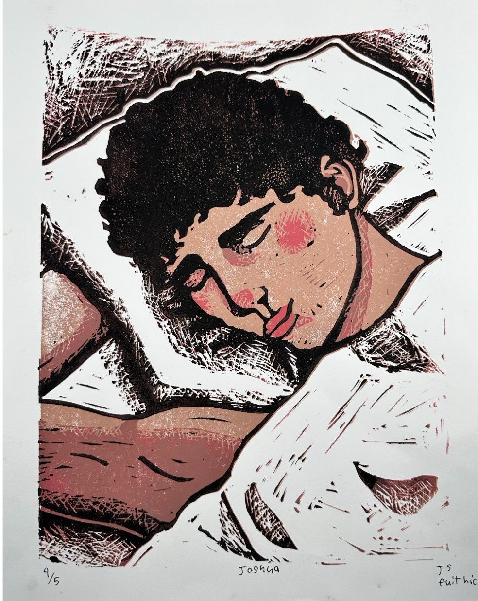
Joshua by Juno Spilker
11th Grade
Ravenscroft School
14 x 11
Linoleum Block Print
Joshua is a linocut print I made in late 2023 for art class. While this was not my first linocut print I had made, it was my first one in color. The limit to the amount of color we could use was 5 including the white of the paper so I tried to push myself to use a more limited color palette of mostly browns which I typically don’t do. Because of the medium I also had to use harder edges for the forms in the print where I usually soften edges. I chose the subject of someone sleeping because it allowed me to have so much negative space with the sheets and pillow.
-
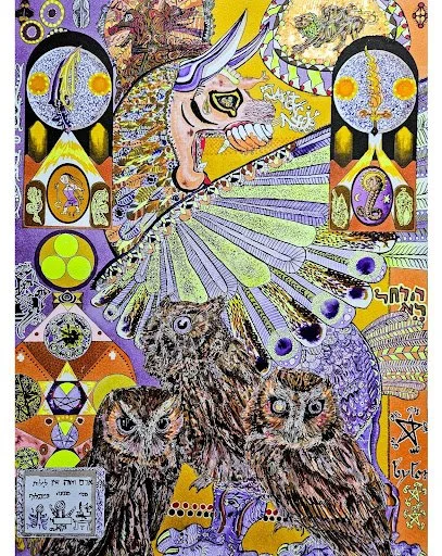
Megascops at the Gate; Rebellio Creationis; The Poison and Elixir of God in the Nightjar's Primordial Bile Duct by Dahlia Reppert
11th Grade
Longleaf School of the Arts
16.5 x 12
Acrylic Paint on Canvas
The mother of monsters archetype is prevalent among a number of cultures ranging through Mesopotamian, Greek, Jewish, Christian, Gnostic, Norse, and Irish cultures. The interconnected tapestry of these mythologies forms a metaphorical machine with each figure as a component in the process of synthesis. Examples of these figures are Tiamat, Echidna, Angrboda, Gaia, Caoránach, Sophia, and Lilith. There is a juxtaposition of intent between the later two; Sophia and Lilith. Sophia is driven by an inherent impulse to create, while Lilith creates out of rage, yet both are acts of rebellion. In the story of Tiamat, she is killed from within and her body becomes the world. Her execution is simultaneously a creation story. Death is always positioned directly adjacent to life. Tiamat, along with many of these figures, birth entities in order to serve a higher goal- often a rebellious one as we see. Yet they often have empathy for these beings, and are the only ones to see the so-called monsters as worthy of life- they see sacredness in all forms of life. Owls are a prominent symbol of Lilith, and are also a common symbol for wisdom, a concept which Sophia embodies as her name in Greek liberally translates to it. Sophia, out of love or morbid curiosity, births Iialdabaoth. Yet her creation is a frankensteinoid contrivance which cannot comprehend the wisdom of its mother. It is similar to her though, in that it too creates. While Sophia hid her child in shame, Iialdabaoth became the demiurge- becoming a dictator encompassing almost all that is spiritual and material in its realm. Lilith carried no shame for her creations, for they were created in spite of her oppressors. She sees the holy as a psychic parasite which projects unwarranted control over its host- and to deal with this particular sort of pest you must get into the mind of a tick. In this syncretism, the god which Lilith opposes is the very child which Sophia birthed. The Old Testament god, according to the Gnostic metaphysical schema, is Iialdabaoth the demiurge. By this logic, Sophia is Lilith's grandmother due to the demiurge creating Lilith. In a way, the quality of Sophia's creation necessitates that of Lilith's, which complicates the moral causality even further. Sophia is behind the gate to heaven, grasping at us, desperately trying to pull us through the bars of the birdcage. Sophia, our grandmother as much as Lilith's, wishes for our transcendence of the demiurge's rigged game. Yet Lilith breaks through on her own, but falls rather than rises. According to Kabbalah, YHWH (Old Testament God) does fall too. Pulled into the tumor-ridden sludge and into the intense fires of unsympathetic judgment by Lilith. Now his impure consort, Lilith victoriously becomes the tick on God's shoulder. Sophia plays a role aligned more with Eve or Pandora; women who are placed in a situation where they are expected to fail and succumb to their humanity. Eve eats the apple, Pandora opens the box- curiosity in direct correlation to utter existential doom. Lilith subverts the trope by acting not out of curiosity but burning intent. She is a parallel to Eve after all, being Adam's first wife. Feminine figures often find themselves shackled within these ancient mythologies, yet these generative beings force a juncture which cannot be prevented even by the godheads.
-

1989 by Avery Faber
10th Grade
Apex Friendship HS
8x11 unmatted
Colored Pencil
This piece was inspired by my interpretation of what my fathers room looked like in 1989. He is a big rock fan so naturally on September 1, 1989 when Mötley crüe arguably best album came out I know my dad got a CD right away and even more so for one of his favorite artists Tom Petty when Full Moon Fever came out on April 24, 1989. Along with most teenage boys he was a fan of video games so when the game boy came out the same year it’s safe to assume he got one, and finally to complete the messy room a pair of beat up converse that he’d play basketball in, all to make up his bedroom floor on some random day in April, 1989.
-
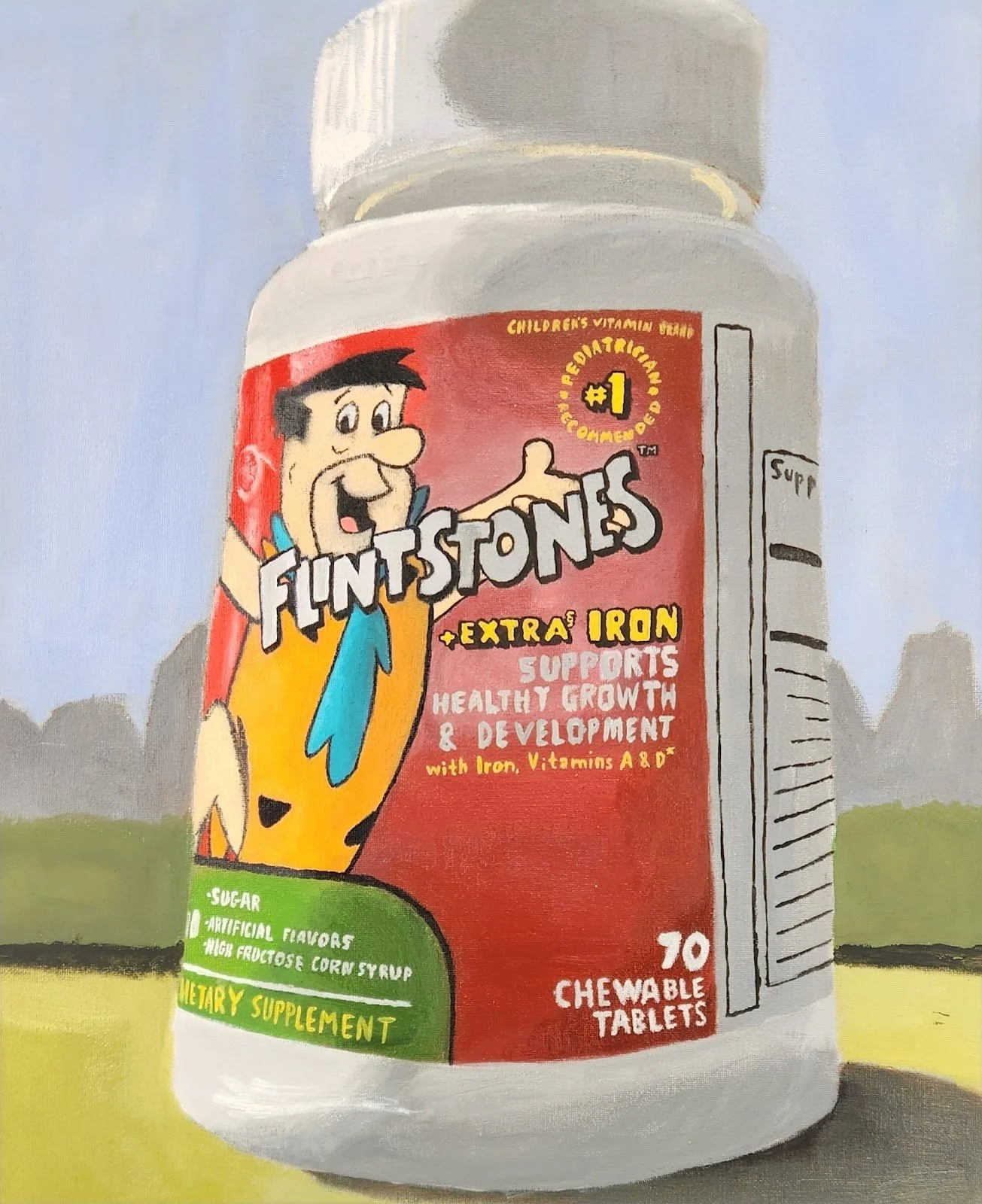
Monumental Still Life by Mars Hartmann
11th Grade
Durham School of the Arts
16”x20”
acrylic
I chose to paint a Flintstones Vitamin container because even though it's some random thing that was sitting in the corner of our bathroom counter, it's very colorful and actually holds some importance because it contains some of the things we need to live (though you can live perfectly fine without it, it makes it sound more important). Since I had to make the container look "monumental", I thought of replacing an actual monument with it, so I chose the Gateway Arch in St Louis.
-

Monumental Still Life by Zoe MacDonald
11th Grade
Durham School of the Arts
16”x20”
acrylic
I selected a broken miniature teacup, and its matching broken saucer as my monumental object. I selected these because they are very important to me, and my childhood. I would play with the rest of this set when I had to stay at my dad's job while both of my parents worked. This object symbolizes innocence, imagination, and comfort for me. Because these are chipped and broken, it would be easy to overlook them in passing if a stranger were to even look at them at all. Objects can retain a piece of the beholder if the beholder gives them space to. It's so beautiful how something so menial can have such a large impact on how one sees the world, or other objects, while another person may only see it as menial.
-
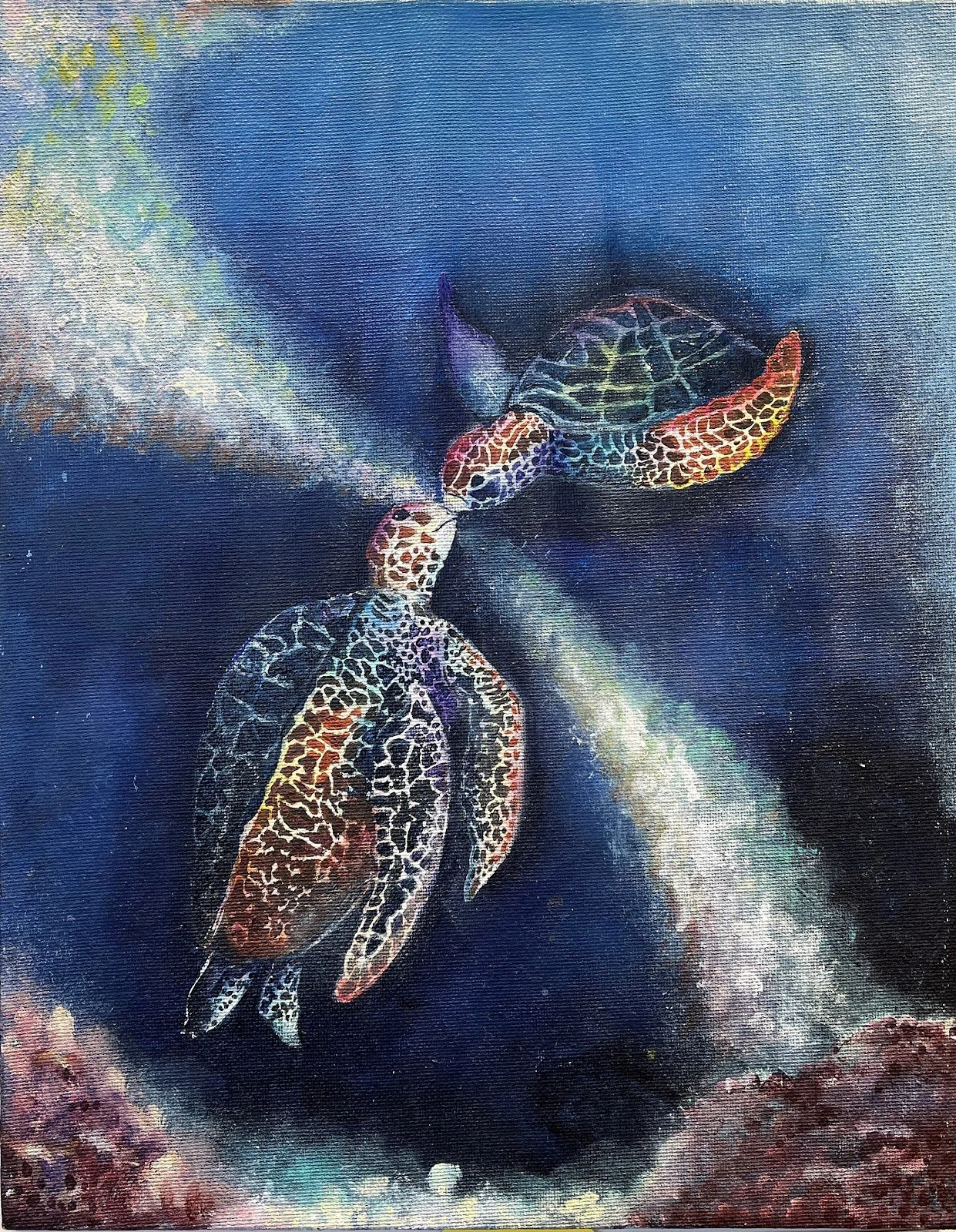
Sea Turtles by Linh Tran
10th Grade
Ravenscroft School
11x14
Acrylic on Canvas
I’ve always been intrigued and mesmerized by the ocean and aquatic life. I often think about my happiest memories, which were with family and friends at our beach house. Even though the ocean is something I hold dear and near to my heart, I do not live with it everyday. What may be a temporary fun time for me, is a reality to many and particularly for these sea turtles, they will probably never get to see anything or go anywhere else in their lifetime. They will most likely never leave the sea. This is why it is important to keep the ocean as pleasant as possible, which is hard with the rise of pollution in our waters. The unrealistic bright colors are a reflection of the plastic in the ocean. I was inspired by Lisa Frank and I thought the bright colors would make it more captivating. I wanted to make the painting fantasy like to express how many people enjoy the beach but forget the sad reality that our world is diminishing if we don’t do anything about it.
-

Cocytus by Spencer Koste
12th Grade
Ravenscroft School
12 x 18, 16 x 20 framed
Toned Silver Gelatin Fiber Print
Every time I look at this photo, I am reminded of the strength of life and its will. Gazing out into the vast barren landscape, the icy wind brushing my face, and the cold sinking into my bones, I am reminded that many people might consider the Arctic dull and static. However, there is beauty in the rough sea, untouched snow, and the hues of grey and blue. The Arctic serves as a reminder that mankind cannot control the unpredictability of Mother Nature. Still, we are not helpless to her woes. Life continues to thrive in this hellish environment-- and where there is life, there is hope. This photo depicts an Arctic landscape naturally vignetted by the sky. Shot on Hp5 at 1600 iso to give contrast and grain, I chose to exaggerate the surrealism of the surroundings.
-
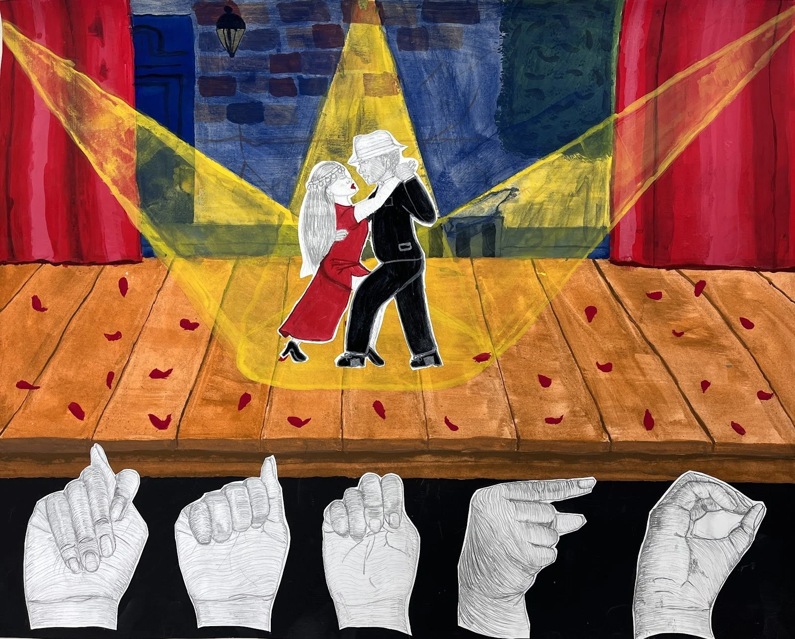
Tango by Zora Mourning
12th Grade
Ravenscroft School
18 x 24
Graphite and Gouache
The painting depicts a Mapuche woman and an Afro-Argentinian man performing tango on a light stage before hands that sign “Tango” in ASL. The piece is made with gouache and graphite. I chose the subject based on my interest in tango. I’ve always wanted to know how to dance it, and I’ve loved tango music since I was in middle school. My science olympiad teacher used to travel to Argentina a lot, and she’d play music she heard in her travels. Those moments of creating while listening to tango music fueled my interest and inspired my painting. While researching tango, I discovered some hidden history behind the dance. While the art form does have heavy influences from Europe, it has strong indigenous and black roots, which were heavily erased or covered up. When you look at tango dancers in competitions, you almost never see black or indigenous people, despite them both playing major roles in creating the modern art of tango. I thought the project being centered around ASL was a perfect way to illustrate and illuminate the silenced black and indigenous people of Argentina. Everything is colored except that which is silent, including both the hands and the tango dancers except for their colorful and bold tango attire, showcasing the hidden identities under the dominant culture. I chose to subtly show the identity of the dancers through traditional headwear, a straw hat for the Afro-Argentinian man, and the traditional headpiece worn by Mapuche women. The Mapuche people are one of the many indigenous groups in the southern tip of South America, and I chose them to depict because of their easily identifiable head jewelry. This represents that despite being silenced by the media, indigenous and black Argentinians still exist. The country of Argentina owes the popularity and formation of its national dance to the people they have tried to erase and silence for hundreds of years: their populations of beautiful black and indigenous people.
-

Venturing by Cashier Brooks
10th Grade
Ravenscroft School
16 x 20 Framed
Photograph
Digital photograph taken on an escalator with cinematic color grading.
Artist Statement: I recently just went on the best trip of my life to Prague that acted as a pivotal moment in my life with the sheer amount of culture and friendship I experienced from embracing the European lifestyle. I had only been out of the country once before, and this time around was my first time in Europe. Of course, I had to bring my camera everywhere I went to capture the jaw-dropping architecture of the city and the famous monuments that paint the city with its rich history. But, I was also fascinated by the unique technical aspects of different areas where lighting and reflections played to create a visual playground. In Venturing, I was drawn to the eerie yet captivating fluorescent lighting bouncing and reflecting off the cold metal of the escalator. While it is ominous, it captures wonder and a desire to seek what’s on the horizon. To further instill the mood, I tweaked with the color grading to give a cinematic feel for the added drama and adventurous characteristic.
-
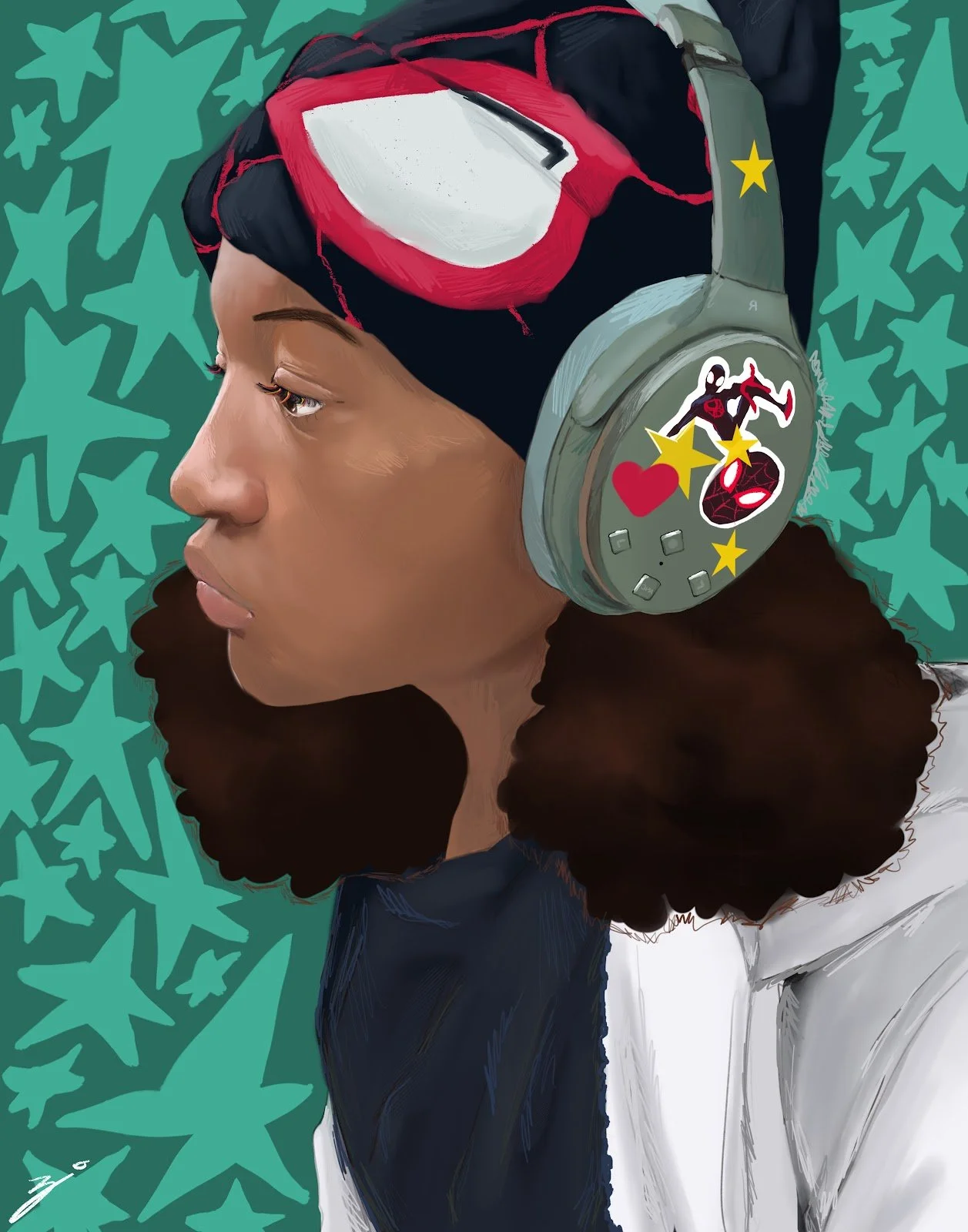
Self Portrait by Zion Jones
10th Grade
Weaver Academy for Visual and Performing Arts
14 x 16
Digital
As a dedicated fan of the Marvel Cinematic Universe, Ms. Jones was inspired to create this Self-Portrait after seeing the film, "Into The Spider-Verse".
-

Uneasy by Karishma Pearson
12th Grade
Broughton HS
8x10
Digital Artwork created in Procreate, printed on paper
Physical appearances is something I haven’t dived into with most of my artworks because I would think about more mental issues. But, physical appearance is a topic I have been avoiding because I make myself forget about how my body looks. I haven’t weighed myself for years, looked at my body as nasty, or care too much about what I eat. The only thing that bothers me is my dermatillomania. It does make me feel insecure about how other people look at me. My mom doesn’t help it either because she points it out and tells me to grow up. Nudity was also new for me because it feels taboo to draw something that has been sexualized by adults. I want control over how I look and feel good about my looks. People who feel like me should be recognized and told that it is okay for them to feel..
uneasy. They deserve to be told that physical appearances are not what makes us human. The porn industry has worsened people’s expectations of what a naked person should have and what makes them attractive. I’m glad I got to draw about the issue that plagues the world and many cultures. I want this to inspire others to feel good about themselves and only change for themselves.
-
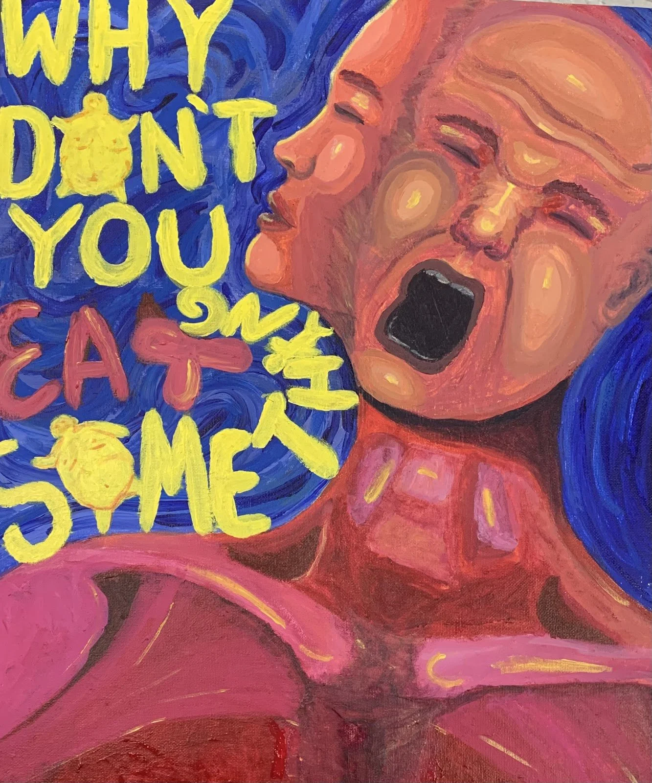
Why Don't you Eat Something? by Mia Katherine Pedraza
11th Grade
Broughton HS
20x16
acrylic paint on canvas
The goal of the piece was to highlight the duality in a person with an eating disorder. One can appear to be well off and kind on the outside but internally are consistently at war with the degrading things they tell themselves.
-

Just Like Virginia Beach by Eve Caudill
11th Grade
Ravenscroft School
8 x 10 - 11 x14 Framed
Oil on Panel
This oil painting has deep meaning to me. It not only honed my skills in oil painting, a medium to which I am relatively new, but the subject of the portrait is of great importance to me. My muse here is my boyfriend, the event my first trip to visit him since he moved from Raleigh to Virginia Beach. He stares off into the distance as the boat we sit on skips along through the salty bay. His skin is made up of beautiful pinks, browns, and purples, which work together to create a skin composition unique only to him. His hair is blown back and stiff from the sea spray, now truly frozen forever in oil. Working on this piece was a reminder of him, the memories we created, and the memories we have yet to make.
-
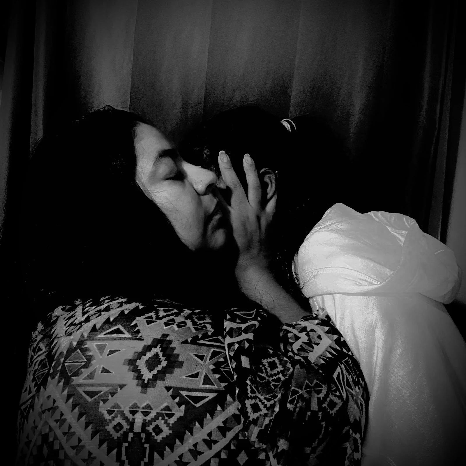
Caricia (Caress, After Mariana Yampolsky) by Camila Bolanos
11th Grade
Southern School of Energy and Sustainability
8 x 8 inches
digital photo
I chose to recreate this photo because even in its simplicity, it has deep meanings that can be interpreted from it. There is a mystery about what is actually happening. It appears as if the mother was trying to protect or hide the little girl's identity. That's what really caught my attention with this photo. The title of the original photo is called Caricia or Caress. Mother love is one of a kind. A mother instinct is to protect her child no matter what.
-

Serengeti by Nick DeGiacinto
11th Grade
Ravenscroft School
16 x 20 Framed
A photograph taken in Kenya and Tanzania.
The pictures in this work where taken in Kenya and Tanzania. They capture the true beauty of nature. They were taken on the Serengeti national park during the migration season. I use the warm colors to evoke a sense of optimism in the viewer as they admire the beauty of the Serengeti national park.
-

Monumental Still Life by Savannah Angelcyk
12th Grade
Durham School of the Arts
16”x20”
Acrylic
I selected AirPods as my object for my painting because I wanted to paint something smooth and it was the first thing I thought of. I also have never seen a painting of AirPods in a tasteful way so I wanted to create something unique.
-

Red and green collage/painting by Alisa Li
10th Grade
Durham School of the Arts
11"x14"
photo/acrylic
A true eye for detail that is meticulously placed" describes Alisa's process. She works in both 2D and 3D and hopes to work professionally in the graphics field.
-

Orange and blue collage/painting by Nyx Lange
11th Grade
Durham School of the Arts
11"x14"
photo/acrylic
Nyx prefers 2D media with an emphasis on painting. She works steadily in realistic depiction as well as stylized expression. If plans as an athlete change, Nyx will focus on Visual Arts.
-

Basquiat Monochromatic by Nina Pankey
12th Grade
Southern School of Energy and Sustainability
9x12
Acrylic on Paper
What inspired me was the love that my father and I have for Jean-Michel Basquiat. With him being both of our favorite artists the decision on what artist to choose was easy.
My favorite part was mixing the different values to achieve a semi smooth transition between the colors
-
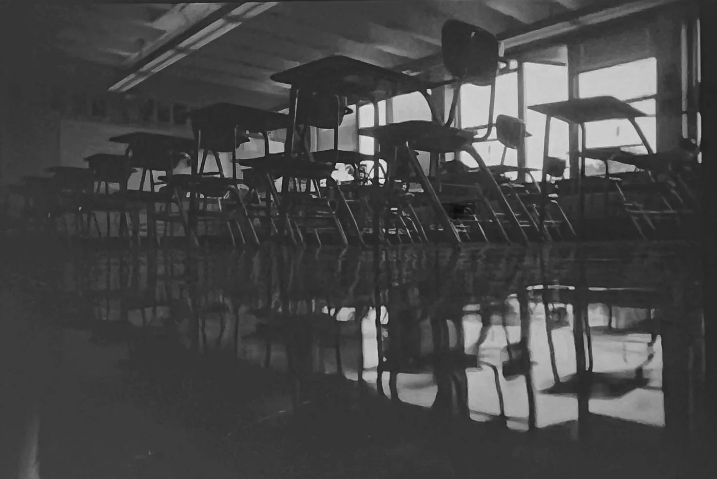
Seniors Reflection by Travis Luke
12th Grade
Durham school of the arts
8.5x11
35mm film
As a Senior I wanted to reflect on what I've done for the past 13 years of my life. I wanted to reflect on what was, and what is now. To glance back at what I have accomplished to look up to new heights while never forgetting the depths at which I started.